
Updates for Tablet Devices
Touch devices changes and enhancements

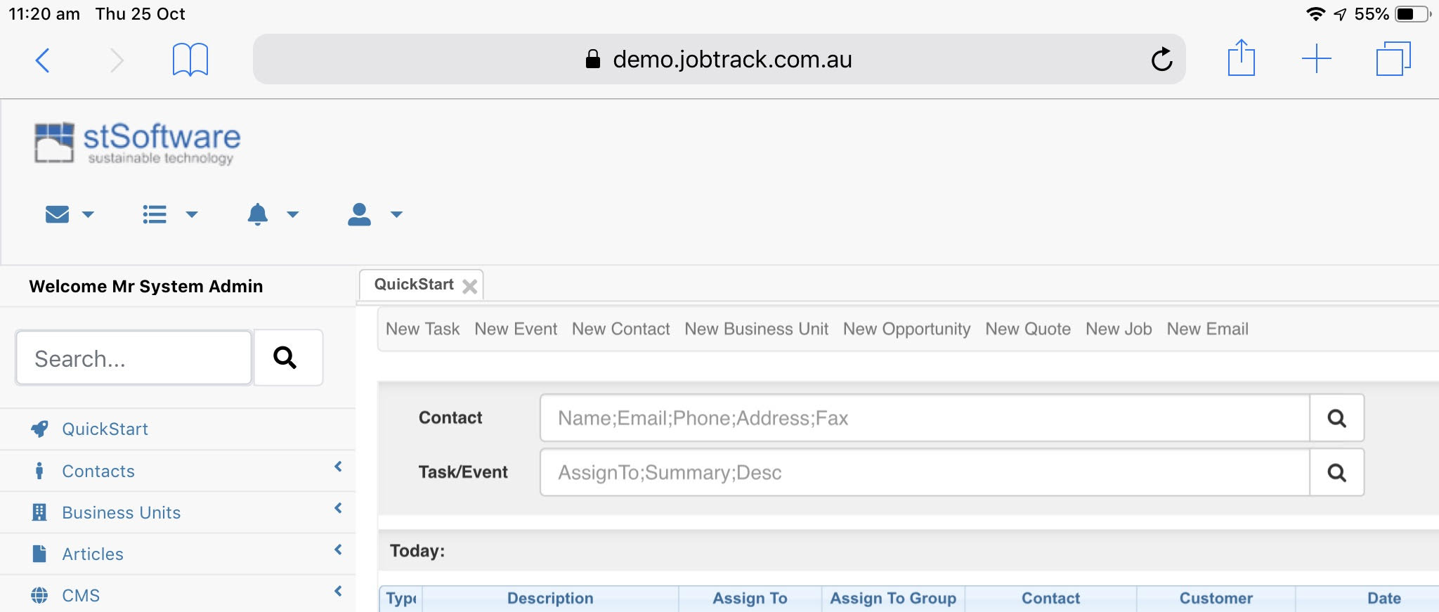
Simplicity and usability are very important to us here at stSoftware. To make your life easier we have optimised some of the layouts on your control panel for the iPad and iPhone screen sizes.
Changes include:
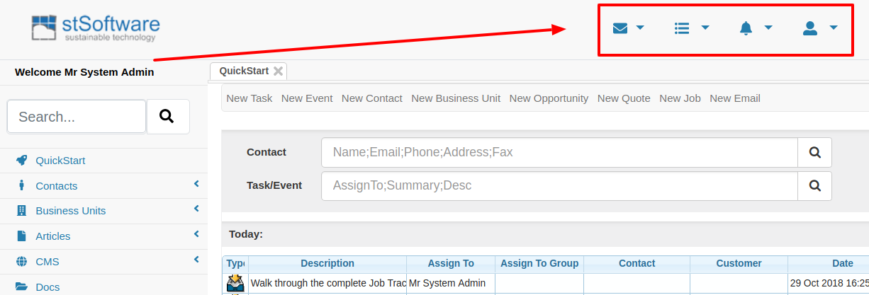
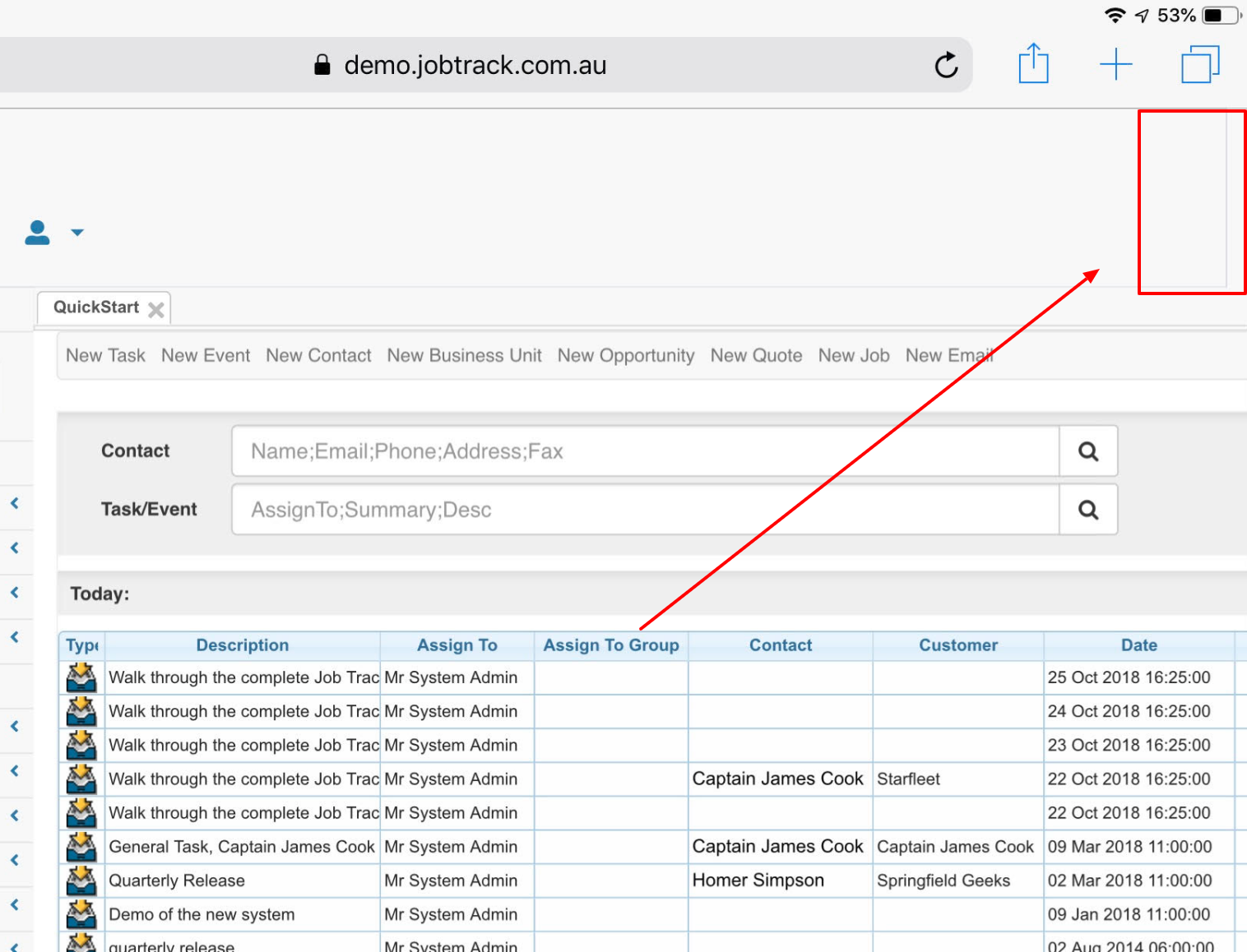
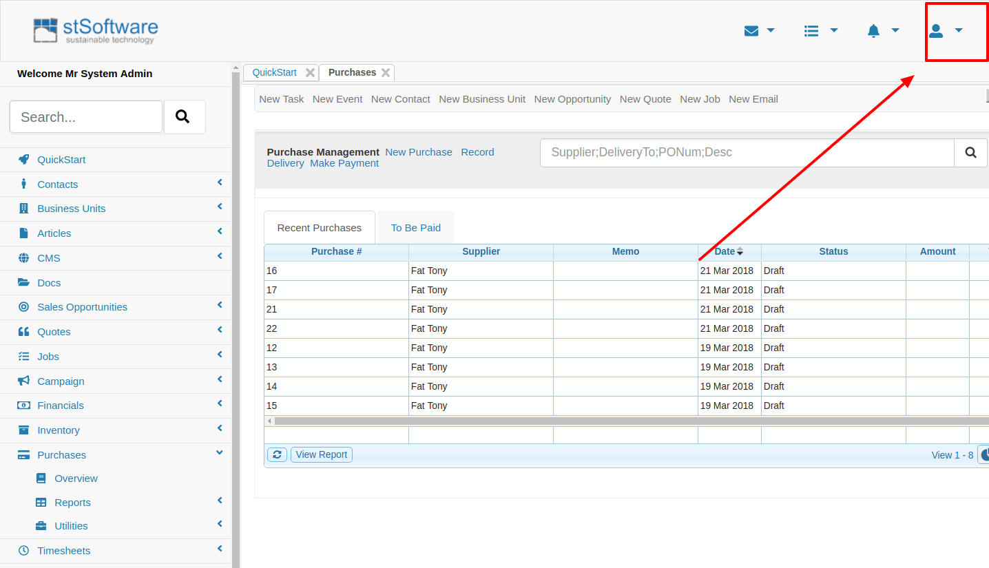
1. Moved Navigation buttons into top right section of screen on iPad.
2. Changed the Menu on IPad and IPhone to be a drop down rather than extending the screen.
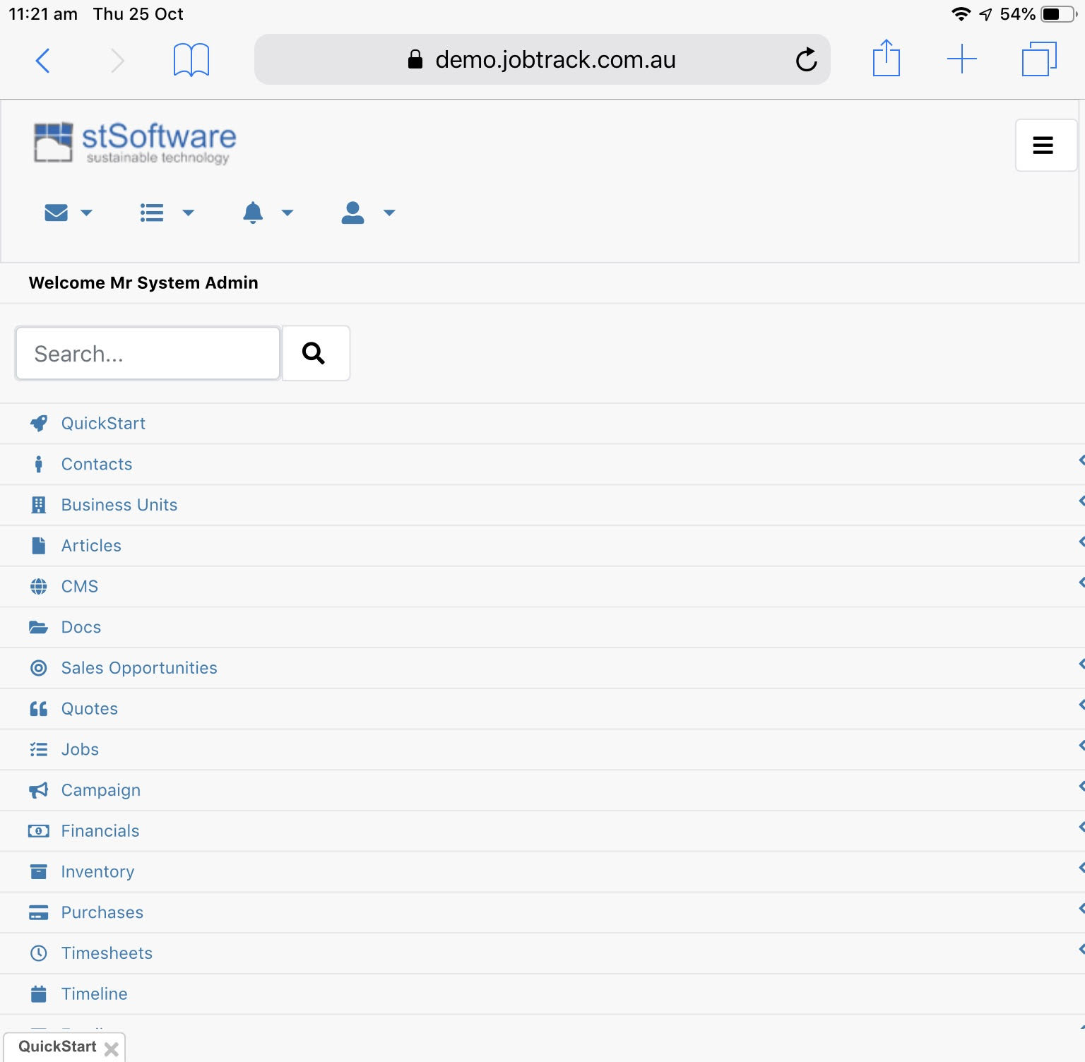
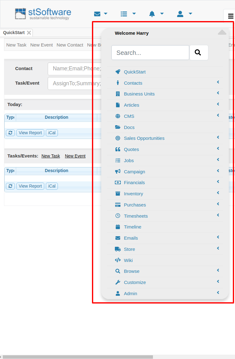
3. Added spacing to margins to reduce clutter.
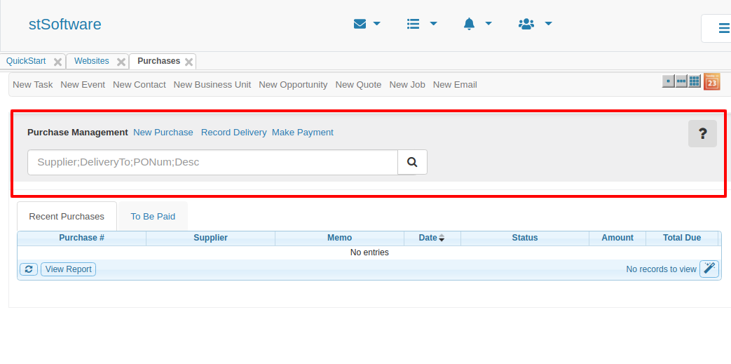
4. Added Shading and borders to various page menus to better distinguish between buttons and content
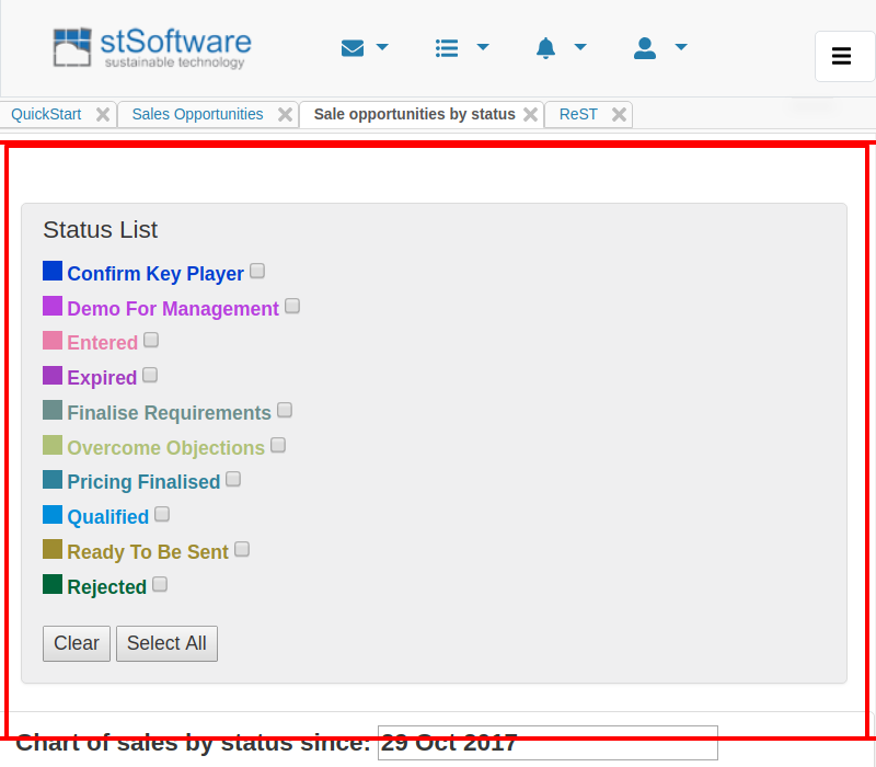
5. Changed the width and positioning of the search box so it doesn't extend off the screen.
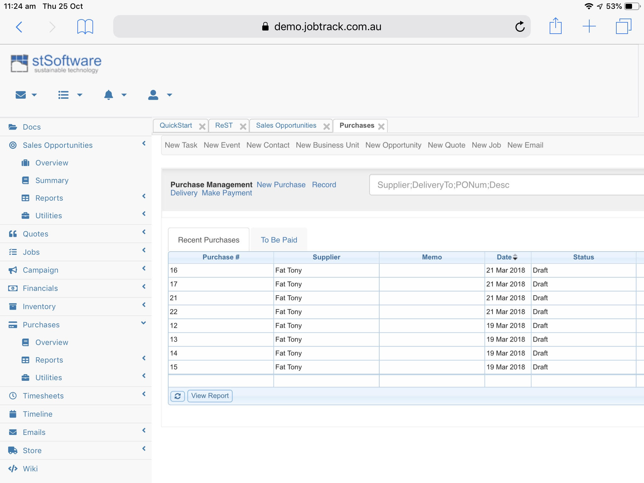
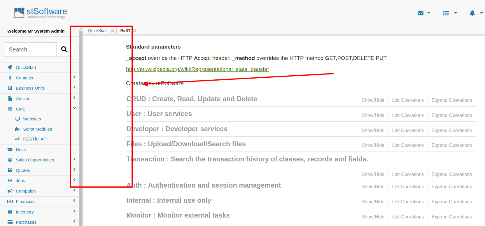
6. Fixed spacing on the top right when scrolling horizontally
7. Fixed problem where users couldn't scroll horizontally on the screen on IOS. This would cut off the page making some parts of the page inaccessible.